Sometimes a website is extremely good in the usability or content part, but fails spectacularly at the user experience part. Today specifically I will focus on light novel readers and show why my reader is better than most of them.
While I think I genuinely built a reader that is better than most of them, personal taste matters no less. This is the best way for me, and I don’t say that you should like it.
Font configurability ramble
While it generally doesn’t matter what colors you use and what font you use (as long as it’s something decent), prolonged reading clearly separates the places where you read 5 to 10 minutes before you go, and the places where you will return continuously to read more.
Serif vs Sans-Serif
While Sans-Serif fonts often viewed as modern and good looking, this is not the best option for prolonged reading. Research indicates that low stroke-contrast serif fonts lead to better reading performance [1] [1.1].
But normally website would have a settings menu to make reader suit your taste?
Yes. And no. While technically those websites provide you with the settings, those are either not enough, hard to use, or unusable at all.
Let’s look at some examples.
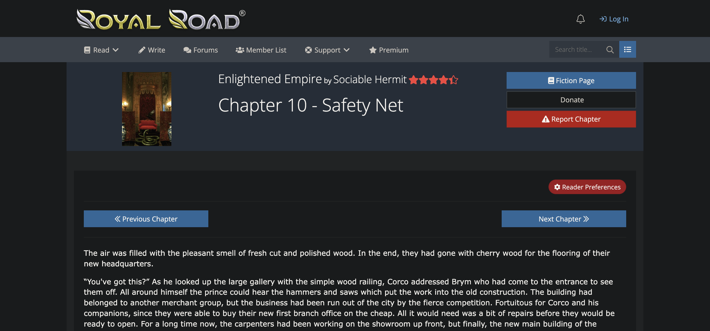
Can you immediately spot the settings menu? Is font up to your liking? No?
Okay, let’s assume you found the settings menu after 5 seconds of intense searching, but what we see here?
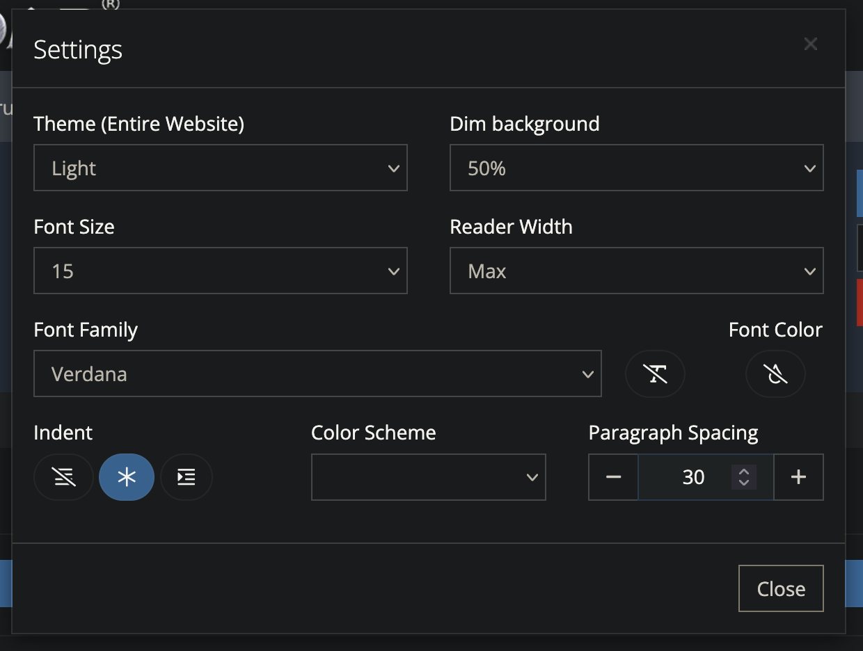 The menu itself is overloaded with settings no one except one person will ever touch. All of the color settings are incompatible with the Dark Reader. There is no text box size setting, which would be really helpful for users with non-standard screen sizes. Next, font selection.
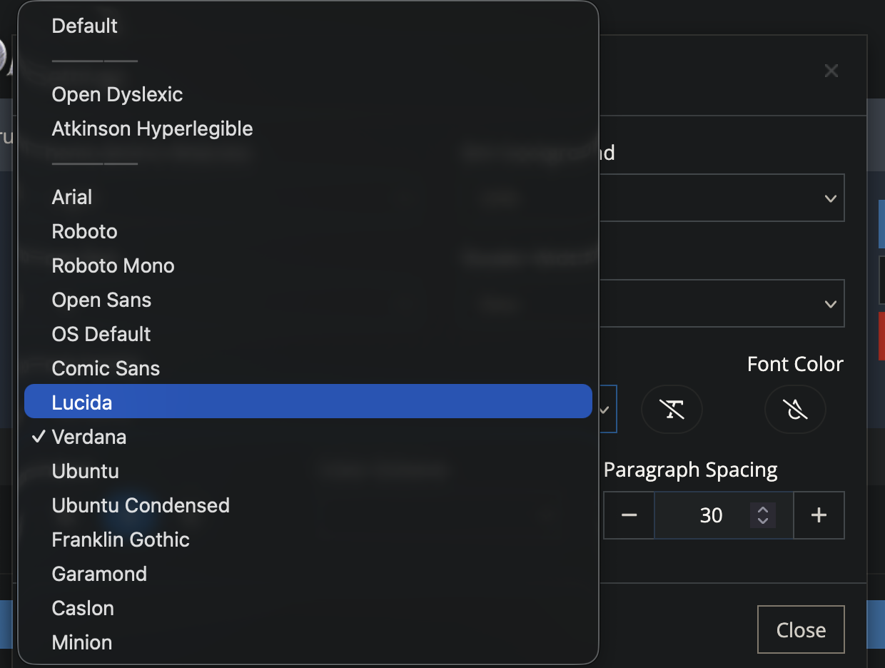 There is literally no decent sans-serif font in the list. Those present are either hardly stylized gothic fonts, or weird hard to read ones. And look at this,
 Comic Sans, while the font itself is not bad and serves it’s purpose quite well, but it is not designed for prolonged reading.
This or similar picture is repeated on most of the light novel reading websites. While some fare a bit better than this one, this is still a problem because often you don’t choose where to read.
Let me also remind you that some of those websites you read novels probably are not exactly very legal. If website is taken down, you gonna have to switch to the next one with different, again UI and controls.
Dark mode support
No one wants to get a flashbang in their face when entering literally any website. That’s just how it is. Dark theme support makes any website much much more better.
Cloudflare and tracking
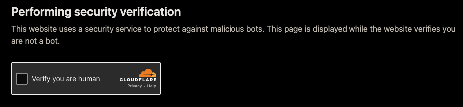
How many times per day do you see a screen like this? If not often, then you’re quite lucky.
I’m tired of these “verification” screens. In truth those do not verify anything, cloudflare specifically, they see you go to different websites every day and still did not recognize you’re human? Of course they know already, this is just a display, not an actual security.
But maybe the website suffers from a DDoS?
That’s certainly a possibility, let’s think about that question for more than a minute. There is little to no reasons for a website like this get DDoS’ed. Even if there are, much better ways of protection than just slapping cloudflare on top it exist. You can implement rate limiting pretty much anywhere in a matter of seconds, and you won’t be compromising on your users’ experience and privacy.
Ads everywhere
Don’t you dare saying that a website needs ads to live. In todays modern age hosting is quite cheap, even for high bandwidths, even more cheap if you serve static content. Now think about what kind of content these websites host: it’s mostly text and a few images here and there, there are no petabytes of videos or tons of egress to pay for. Furthermore, there exist a negative correlation between quantity of ads and quality of content on a website [2] [3] [4].
What I made
Rezeror a single-novel reader. Made for Re:Zero light novel. And it have cost me literally 0 cents to build (except the part where i have to buy a laptop and pay for internet connection).
What it does better
- No aggressive cloudflare
- No ads
- No tracking (at least on my part)
Then let’s move onto the reader user experience part. Look at this screenshot.
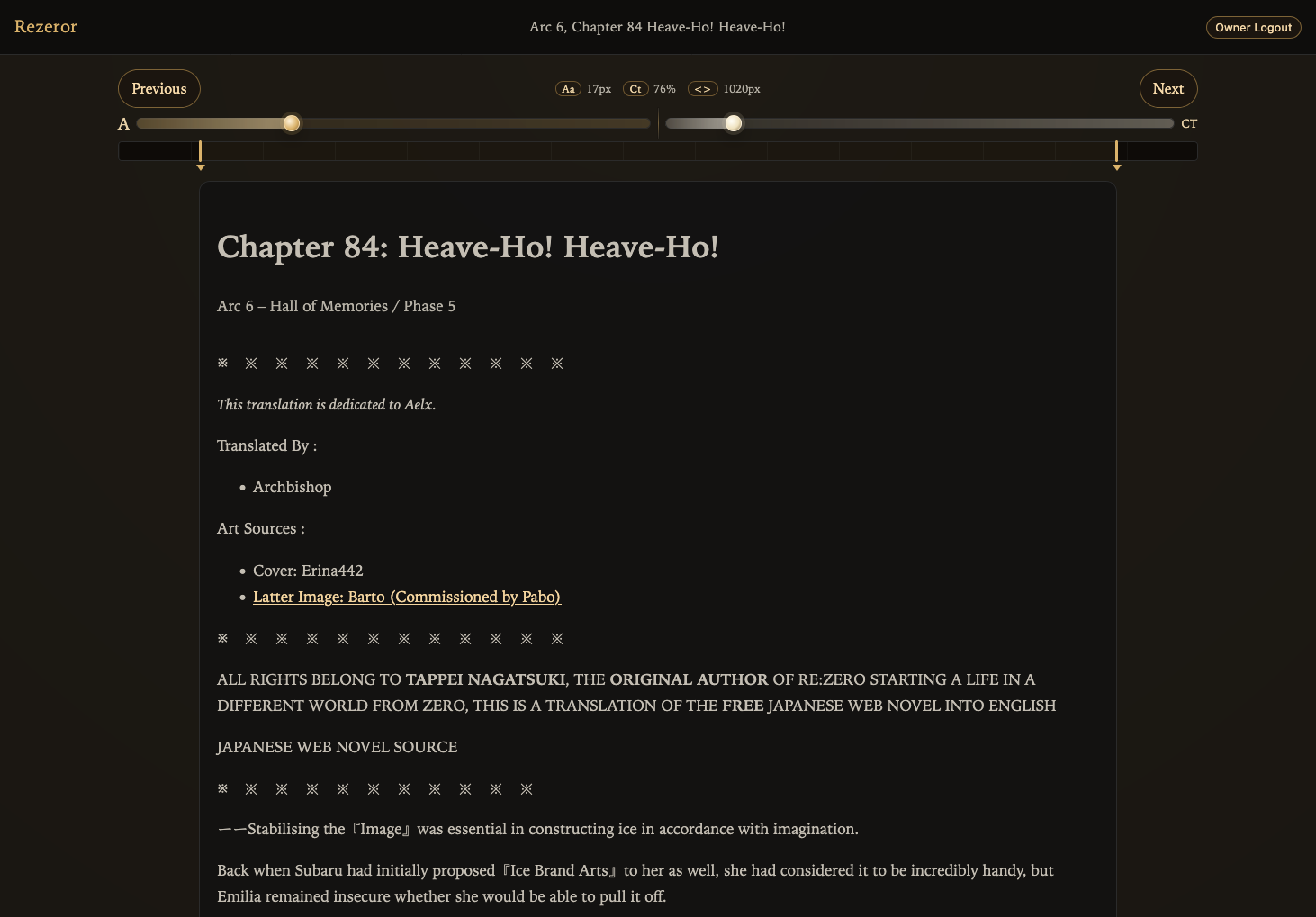
All controls are immediately visible and are in user’s attention, no additional actions needed to change something.
But not only the controls are in the correct place, those also work better than those starship control panels.
Let’s see:
Resizing the text container is now intuitive.

You can immediately see you changes without obstruction.
And while this kind of controls features less customization ability, it is likely you don’t need all these. Most common settings that people are likely to change are already out there, and remaining things were decided by me.
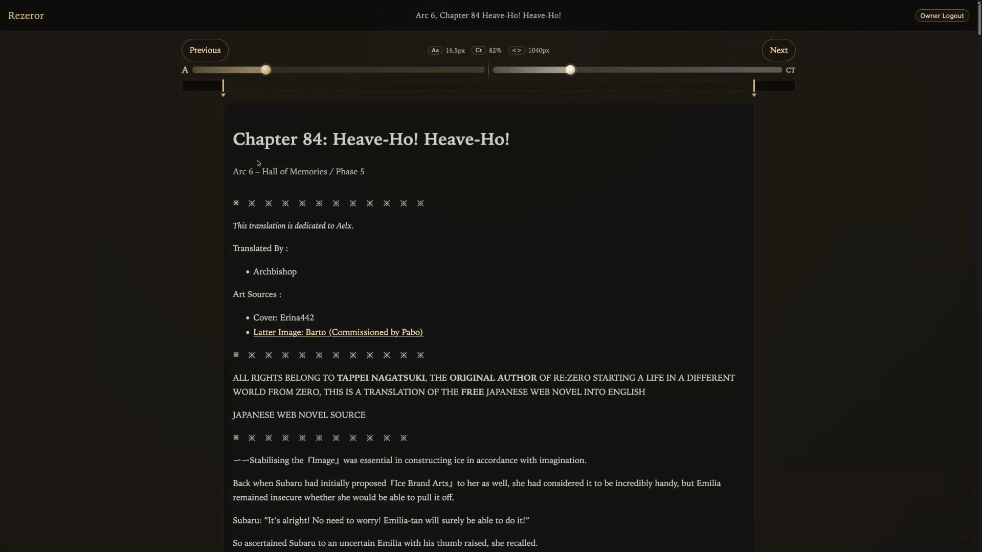
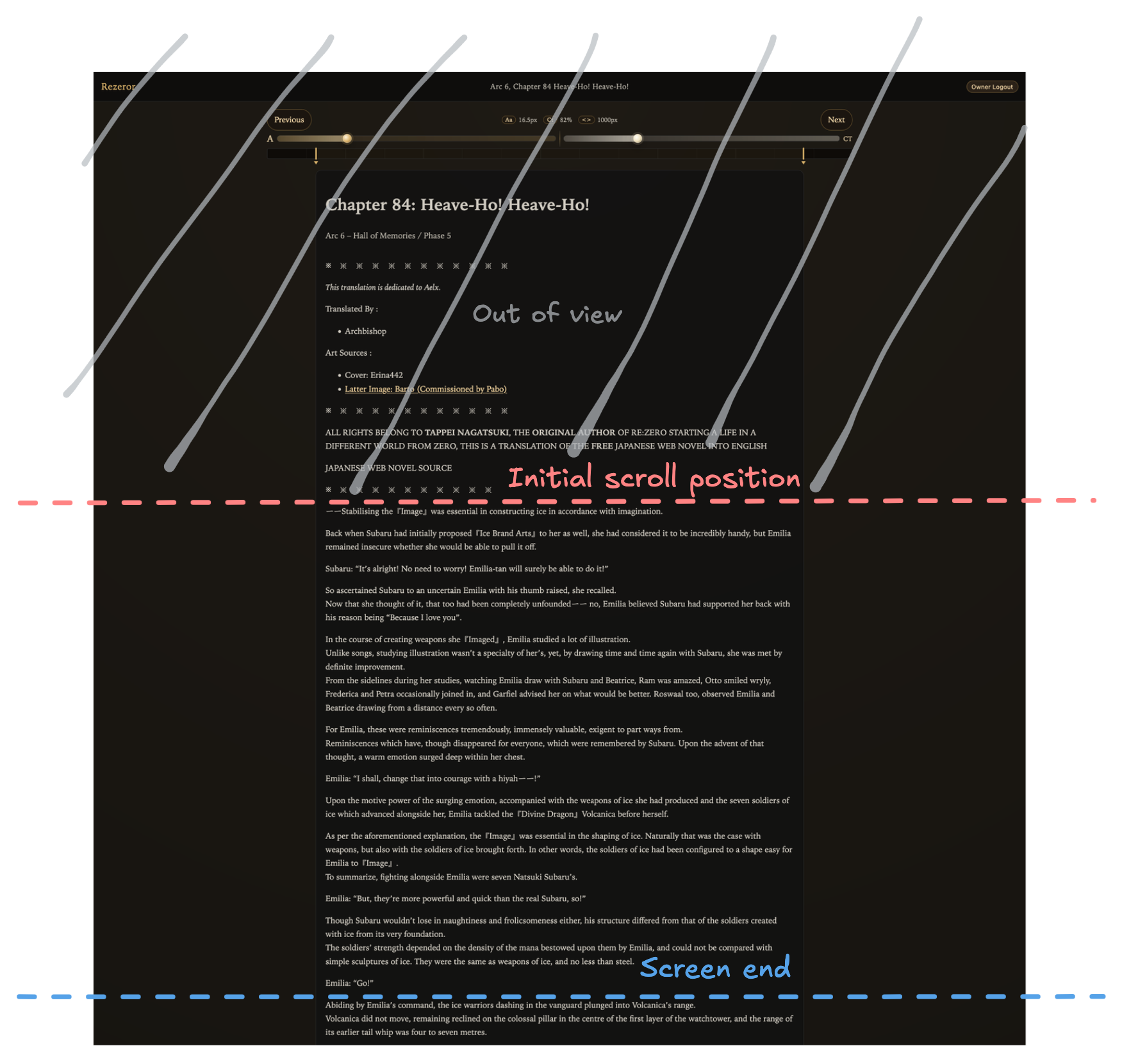
Did you see what just happened? Let me explain.
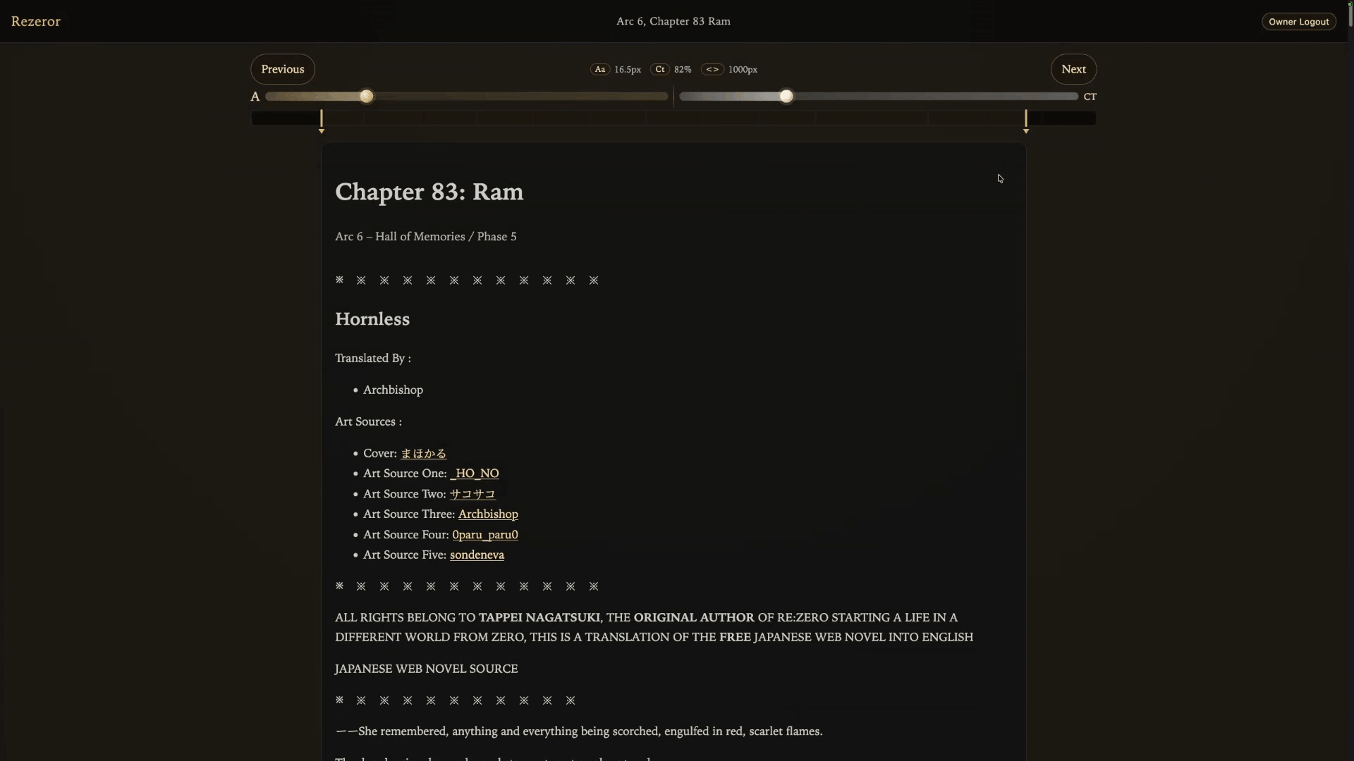
There is this “preamble” before the actual start of each chapter, while there is nothing wrong with the preamble itself, we don’t really need it while reading, so when the chapter is opened for the first time, scroll position is automatically set to the start of actual content.
There is also little features like showing current arc and phase when scrolling through the library, translation notes can be opened by hovering over the note number in the text so you don’t need to scroll down to read that translation note.
Conclusions
I don’t like overcomplicated interfaces, ads, cloudflare, tracking and bad fonts. So I made the reader that beats all other readers in these aspects. It’s also quite fast and open source.
End.